
How I built a COVID-19 tracking dashboard with Python
An open-source Django and Plotly dashboard for the pandemic: trusted data sources, a responsive card layout, and the Python and JavaScript that powered more than 200k visits.
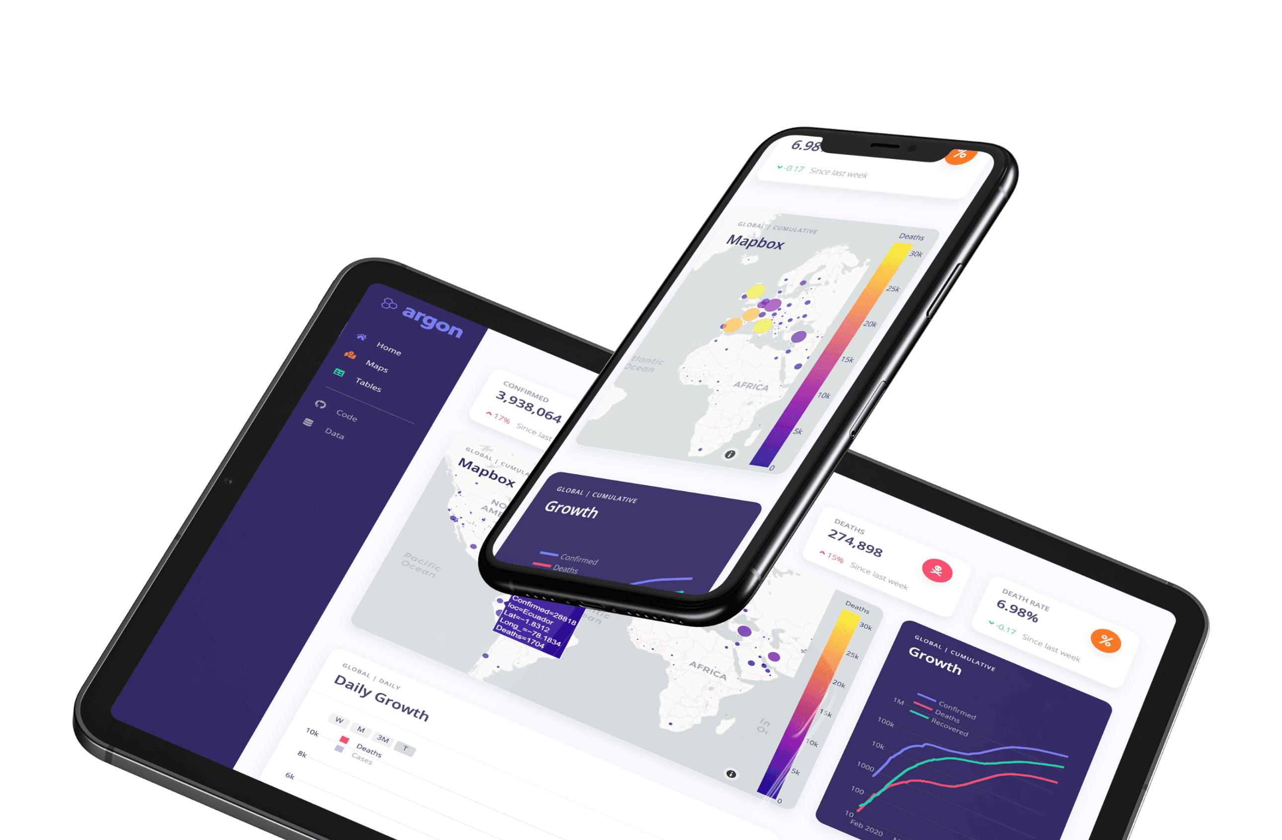
Why start this project?
When I started this side project there weren't many dashboards or sites to track data for the Coronavirus pandemic, other than the very popular web app created by Johns Hopkins University. My idea was to create an open-source version that encouraged collaboration to derive some creative design and functional ideas. And that's precisely what this project became.
The best way to prevent and slow down transmission is to be well-informed. — World Health Organization
We have  contributors from all over the world (Spain, Poland, India, and various places in the USA) who came together to create something useful and meaningful. The dashboard ended up receiving over
 200k visitors, but the most rewarding part was collaborating with people across the world. It brought key stats, cumulative and daily growth charts, country-level tables, and a fully interactive Mapbox map into one responsive overview of the pandemic.
Data Sources
A large portion of the data comes from one of the original data repositories tracking COVID-19 cases, Johns Hopkins University CSSE2019-ncov data repository. Additional data was collected from Our World in Data GitHub data repository. Lastly, to fill in some requirements we retrieved data for daily cases from
New York Times COVID GitHub data repository.
For this project, it was crucial to have accurate, trustworthy datasets. That is why those sources were carefully chosen. The goal was to represent the pandemic as accurately as possible. Getting that wrong at scale would have real consequences.
Technology stack
This project began with Python-based Jupyter Notebooks, and the use of Plotly, "the leading front-end for ML and data science models in Python, R, and Julia." But I needed a way for this to be accessible to the public, so I moved it onto the Django web framework. Django encourages rapid development and clean, pragmatic design. To bootstrap the initial dashboard grid we used Appseed and Bootstrap 4 for custom UI where we needed it.
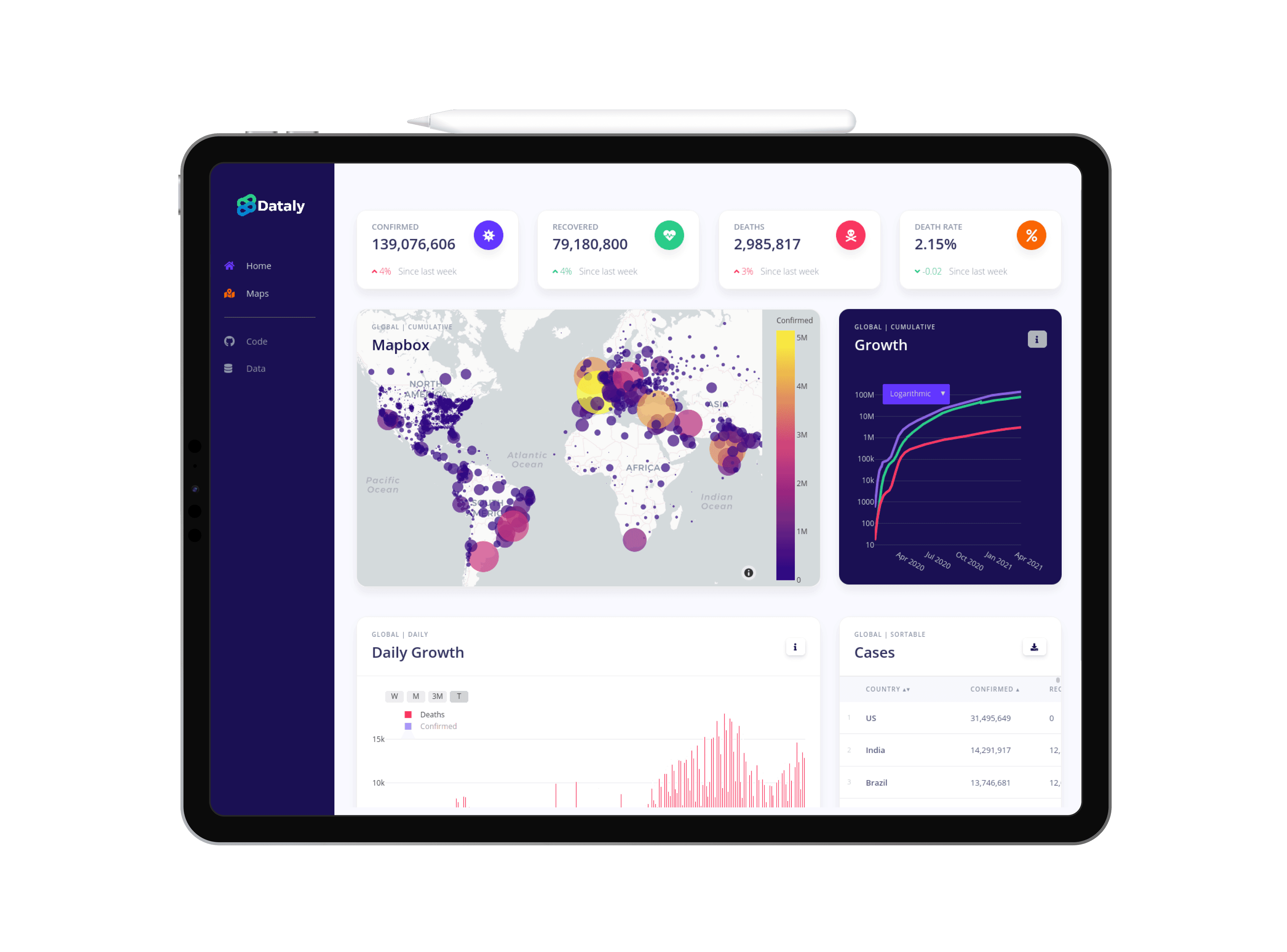
Tablet view of the dashboard's home page. The application is designed to be responsive to all platforms and devices.
Front-end design
Overall the general approach of the application is to display a grid of different cards. The cards represent different forms of data organized in their respective way, and the user can interact with the data in several ways. We have a map card that uses COVID case data stacked on top of GPS coordinates. In another card, we have a plot that shows the overall trajectory of confirmed cases using time-series data with dates.
I designed the dashboard with a mobile-first approach, ensuring the layout worked across viewports. Plotly and Mapbox already handle multi-touch interactions, so most of the work was making the overall grid adaptable. Bootstrap 4 made that responsive structure much easier.
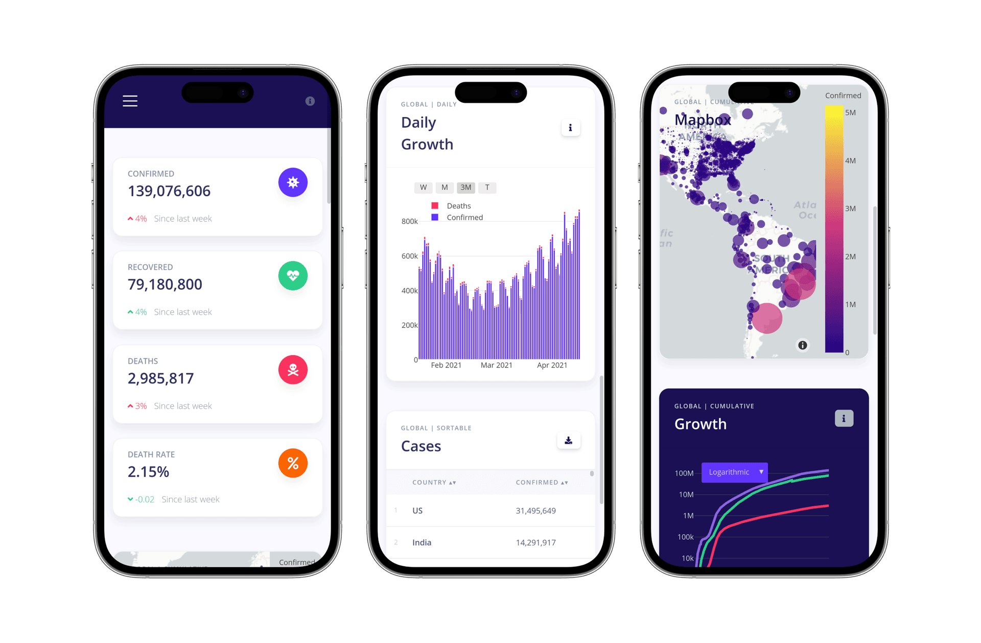
Mobile view of application, including list of key statistics, the map of daily growth, and the fully interactive map made using Mapbox.
How it works
The following is a snippet of how we're using Python to scrape the data from different sources and return that data to the front-end to create data visualizations with Plotly. Using AJAX requests allows us to load the data asynchronously, which is a great way to improve the user experience by significantly reducing the initial page load time.
Note that the example code is incomplete for concision.
1. Web scraping with Pandas
Here we defined a simple function that reads from a specific URL that contains a CSV of raw data, we convert it to a Pandas data frame and return it.
Pythonimport pandas as pd

def confirmed_report():
  # Returns time series version of total cases confirmed globally
  df = pd.read_csv('https://raw...CSSEGISandData/...csv')
  return df
2. Data cleaning & formatting
Now we define the function realtime_growth which cleans and manipulates the data frame returned from the above function. We need to do this because the data is not in the format we want, and we need to clean it up.
Pythondef realtime_growth():
  df1 = confirmed_report()[confirmed_report().columns[4:]].sum()
  df2 = deaths_report()[deaths_report().columns[4:]].sum()

  growth_df = pd.DataFrame([])
  growth_df['Confirmed'], growth_df['Deaths'] = df1, df2
  growth_df.index = growth_df.index.rename('Date')

  yesterday = pd.Timestamp('now').date() - pd.Timedelta(days=1)

  return growth_df
3. Sending AJAX request
Using AJAX in JavaScript to send an asynchronous request to the Python backend. If successful then we create the data visualization (in this case, a scatter plot with visible line traces) using plotly.js.
JavaScriptfunction load_realtime_growth_chart() {
  var xhttp = new XMLHttpRequest()
  xhttp.onreadystatechange = function () {
    if (this.readyState == 4 && this.status == 200) {
      /* plotly.js code here*/
    }
  }
  xhttp.open('GET', 'realtime_growth')
  xhttp.send()
}
4. Plotly to visualize the data
We then create the D3.js-based line and scatter plots in JavaScript using Plotly. This creates an interactive, scientific data visualization easily on the Web browser. This one will probably be the most complex-looking part of the code because it takes a lot of tweaking to get the plot to your desired look and feel. But trust me it's simpler than it looks.
Visit plot.ly for docs and examples.
JavaScriptvar plot_data = [confirmed_trace, deaths_trace]
var plot_layout = {
  yaxis: { automargin: true, type: 'log', gridcolor: '#32325d' },
  xaxis: { automargin: true, showgrid: false },
  showlegend: false,
  hovermode: 'closest',
  updatemenus: [
    {
      visible: true,
      type: 'dropdown',
      buttons: [
        {
          method: 'relayout',
          label: 'Logarithmic',
          args: [{ 'yaxis.type': 'log' }],
        },
        {
          method: 'relayout',
          label: 'Linear',
          args: [{ 'yaxis.type': 'linear' }],
        },
      ],
      x: 0.05,
      xanchor: 'auto',
      bgcolor: '#6236FF',
      bordercolor: 'rgba(0,0,0,0)',
    },
  ],
}
Wrapping things up
The result is a set of real-time visualizations that work across devices and respond to both mouse and touch. Nothing fancy, just Python, Django, and Plotly running on the web, where anyone can open a link and explore the data.
Did it meet the original goal? Yes, and then some. The dashboard drew over 200k visits, which still feels surreal. What I remember most is that people actually used it — and hopefully walked away with a clearer picture of what was happening during the pandemic.
If you're a developer and want to dig into the code, check out the getting started docs in the GitHub repository.